PALE ISN’T STALE: TIPS FOR DESIGNING WITH WHITE
No white after Labor Day? For those of you south of the Mason Dixon line, this may be the one line you never cross. Maybe it’s time to reconsider? There are so many fabulous ways to use white, not just as a canvas, background, or base color – but as an entire design scheme.
Okay. We know what you’re thinking. Designing with white is risky. Well, that’s our point exactly. White can be daring, seductive, not to mention chic! So in honor of the annual banishing of white pants, shoes, and bags to the back of the closet here’s our blanched and unabashed celebration of the fall season’s most reviled color.
Let’s face it, beige IS boring, but opting for a clean, crisp palette of pure white is far from it. Throw an expensive white slipcover over your sofa and then host a red wine tasting. If your adrenaline doesn’t spike, call your doctor, sweetheart.
A WHITER SHADE OF PALE

Benjamin Moore offers no less than 200 different shades of white. What could possibly be boring about pouring over 200 paint chips?! That’s the stuff dreams are made of here at PHAG…
“WHITE-OUT”ARCHITECTURAL FLAWS

Think of white as creative camouflage. If your room has structural quirks – like a large ceiling pipe in an obvious place, a coat of white paint that matches your walls makes it instantly invisible. Now you see it, now you don’t. No rabbit or top hat required.
VERSATILITY
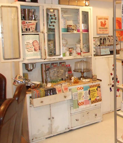
If you can’t bring yourself to embrace a monochromatic motif, a judicious use of white in any room can make dark floors “pop” or call attention to colorful artwork, textures, and accessories. So if you can’t commit in a big way, start small and build on it. The most important thing is that you surround yourself with the things you love, no matter the shade.
At PHAG, we believe that great design is intensely personal. So if you LOVE white, ditch the calendar, grab a can of white paint and go for it. The possibilities are endless.


Recent Comments